







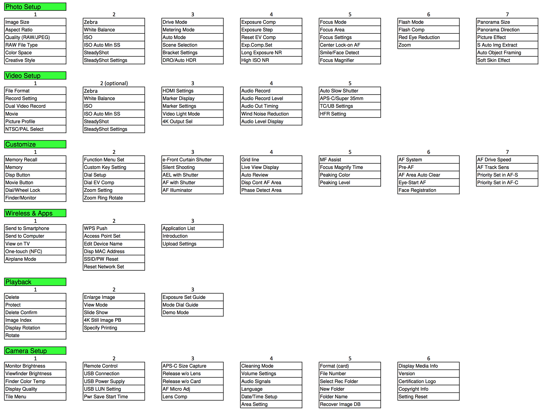
This is a new Sony menu redesign proposal from Alexander Okolo-Kulak:
“Attached above (Click on it to enlarge) is my attempt to rearrange Sony camera menus with then following objectives:
– Retain the Sony menu structure
– Create new Video Setup menu to house all video related menu items
– Combine Applications with the Wireless menu
– Group menu items functionally, whenever possible
I have added the menu #2 in the Video Setup (as option) which is an identical copy of the Photo Setup menu #2, with an idea that it might be useful to have different settings for these items to quickly switch from photo to video and back just by pressing the Movie button, without going through the menus; more menu items may fall into this category.
The menu items used here are based on the recent Sony cameras: A7M2, A7RM2 and A7SM2, and I hope have not missed too many. On the other hand, not all cameras in all regions have all listed menu items available.
These arrangements were partially inspired by your previous post from Per Kylberg.
I hope that eventually Sony will take it serious and improve their menus.
Regards,
Alexander Okolo-Kulak
Toronto, Ontario“
31 Responses
Seems to be a bit better than the Sony one.
But honestly I think there are three things most important to change with the menus:
1. A custom menu “My Menu” or “Custom”, where you can add your own most used settings. This would solve close to every problem anybody ever had! Can’t find a setting you’re searching for often? -> put it into Custom.
2. Taking apart video and stills specific stuff. For me personally all the video settings are of no interest. And I would like to have them all in one subsetting so I can ignore all of them at once.
3. There are still some things that need to be asignable to a custom button. Cropmode for example. But there are others.
Why should this Alexander Okolo-Kulak matter?
Wow.
Sony is reading this blog so I think Alexander is taking a good initiative here likewise for Per who had a go at it too. The bottom line is that such an exercise may help Sony better redefine the menu structure.
Are you bothered with this ?
I see the criticisms of the Sony UI and understand many of them, although I don’t actually believe Nikon and Canon are much better. However, I suspect that while many find fault do we really appreciate the mechanism involved?
Of course, we need a system for controlling every variable but, ultimately, it comes down to a feat of memory and a preference for associations to help remembering.
Clearly, Sony have grouped some items together that others would not, but you could argue endlessly of the rights and wrongs. Ultimately, it doesn’t matter what the groupings are as long as it aids the memory of where each item lies, which is why many (including myself) call for custom menus.
Perhaps the most frustrating aspect is that, as the menu is entirely software based, it should be very easy to implement.
Personally, my form of customising would not be too concerned with moving items, but rather to allow hiding of unused functions. It would be an interesting exercise to see just what proportion of the menu items are ever accessed in normal use. I doubt it would be more than 5-10%, so all the rest could be hidden. That would speed up selection vastly. You could have a hide/show toggle by a long press of ‘Menu’ while in menus, for example.
If Sony had the sense to create such a feature, and the courage to give full button freedom in future cameras, they could achieve very high market acceptance in one fell swoop. After all, almost everyone would then find their cameras easy to use!
I agree. Customizable menus and buttons would be perfect!
The menu system should be customisable with one or many selectable css-files on the memorycard and html-compatible. Then everyone could make their own menu-system, and people could easily share them as well.
Open source it!
Or at least allow to shortcut everything in a custom menu, not just the Quick menu.
Focus related functions need to all be groped together…they are scattered in this propsal.
Possibly an actual focu heading.
Drive type should be a camera setting, not a custom setting.
This settup is not quite there..needs some work.
Top priority in a new menu should be to have items arrange so related/similar functions are grouped together rather than scattered in differrent places.
This layout does not achieve that.
They should just allow you to tweat all configurations via APP(smartphone/PC) and then transfer the preset to the camera via wifi/sd card.
The big item is not the menu layout, it’s giving us access to put any item in the FN section particularly crop mode, format, image review on/off. Just that alone would once setup have the need to go into menus very rare. Also give us more options on custom buttons.
The idea is the FN should be more like my menu. It’s quick , it’s easy to get right too it make the adjustment and get out. If they give us this than menu layout is not as important but FN and custom buttons is.
The custom menu is the obvious best option. The best way to do it, is as an off camera app.
It’s not a difficult thing to write the software that allows the user to generate not only their own menu system…but also create custom setups OFF the camera, and make decisions like how many stops the camera will bracket, etc.
When you hit “menu” the first menu should be:
Custom Menu 1
Standard Menu
Custom Menu 2
If I could just ELIMINATE all but the half dozen things I need my menu for, I’m happy. And with a first menu that makes it easy to drop back to the standard menu, there is zero penalty.
This could be a marketing monster for Sony:
“The world’s most customizable camera”
It would be cool if they allowed custom menus as downloadable apps so you can have a clone of canon or nikon or even just a person who made a good menu. We can use any lens we want so I don’t see why the menu should be any different with a few tweaks to sony of course.
Ok….
I would strongly suggest that you break out the ‘Photo Setup’ into 2 categories: RAW & Jpeg… That way those of us that shoot RAW exclusively could have a much shorter more simplified list of settings when shooting RAW… Why include any of the ‘scene’, DRO’, Jpeg and other useless settings that do not apply when shooting RAW?
Two add ons: Color coded and icons.
AF functions are still spreadout across several pages and several tabs.
This is proof that UX and UI design are not as simple as some people may think.
Dear Sony, here’s the steps to make your A7 line a lot better and to silence 99% of the complaints about menu/interface:
1) take a Leica SL and take a LONG look at its back side. Long as in, 6-7 weeks.
2) turn it on.
3) look at the LCD screen.
4) take another LONG look at the back side, and a good LONG look at what appears on the screen when you push the buttons.
Start from there. Thank you.
(edit: watching this video may help your camera body and software engineers. And the design team. https://www.youtube.com/watch?v=_HPLRS1PV-8 )
That is the worst example Sony may use. SL is disaster
…and I guess that comes from your extensive hands-on experience with the Leica SL, right?
I wrote that post after having spent a wonderful hour with it earlier today, and although I’m not interested in such an expensive camera, I found the build quality, the evf and the menu system to be absolutely stunning. Just my humble opinion.
I have spent 2 years with a7 system and find it vastly superior to SL. 4 dials, many customers buttons, function menu. I never had to enter the menu when shooting. Not Once! Except when showing a friend some weird function. I actually do not know the menu. I do not use it
Can you please answer my original question and kindly tell us how much time you have spent trying the Leica SL to dismiss it so quickly?
I watched some videos like the one you showed and read about it. It is not imported at all where I ,I’ve for its absurd price. Yet two dials is just now t acceptable to me. Oh and it is not quick I was happy with this new Leica at first then watched some videos, looked at detailed specs and was baffled by the absurdity of this disaster
PS to some extend this Leica is reminiscent of the nex-5 UI. I think it it’s good we are back to the old SLR style confusing menu system
Sorry you cannot try it. I only speak from experience, I don’t really trust videos or reviews online. I was very sceptic about the SL when I first heard about it, and as I wrote before, I’d never buy such an expensive camera. Besides, there are indeed things I don’t like about it, other than the crazy price.
However, those 3 features I wrote about in my earlier post are, in my opinion, truly amazing.
– The camera feels like you could use it as a hammer, it reminded me of an extra-solid version of my old Nikon F3. No plastic, at all. Pure metal. Heavy? yes. But it just screams “solid”.
– The EVF is quite spectacular, but I guess Sony will sooner or later introduce an even better EVF to its next A7 line iteration, that’s just a matter of time, and the one in the A7R II is already very good.
– The menu and user interface are so well-thought and work so well together, you almost feel stupid using it. I guess getting used to just 4 unlabeled buttons would take a little adjustment time, I surely didn’t get used to it 100% in an hour, but to me it made a lot of sense. Again, just my personal opinion, and even the SL has some design solutions that come out of nowhere, but overall I think it’s pretty awesome.
As I mentioned in my post, almost all of menu UI revolves around a feat of memory and the Leica is no different. In fact, you could argue they acknowledge it by having no labels, not even ‘A, B, C, etc.’.
The ‘Favourites’ is good, but I think my suggestion of being able to hide items would be as effective and very simple to implement. You could add ‘re-order’, but that might complicate unnecessarily. It could be an option, though
If a manufacturer wanted to make a ‘hide/unhide’ system really sophisticated they could have an optional ‘automatic’ feature, which would hide those items not used after a set number of times powering on the camera. If you just needed a long press on menu (when in the menu screens) to toggle hidden items then there wouldn’t be any difficulty to find them. They would then appear in your ‘shown’ menu until the same default time had passed.
I reckon you would soon have a menu with only about a dozen frequently accessed items on show. Easy peasy!
agreed.
I guess it also depends on very personal preferences and how the photographer finds himself using the interface. I’m looking at the back of my 5D mark III as I’m writing this, and frankly, out of its 15 buttons, I find myself using just 3 of them 99% of the times: menu, where I usually access just my short custom list, review, and iso. If I’m using autofocus, I then also use the little joystick and the af-on button, but that’s pretty much it. That’s maybe why I personally find the Leica SL menu system and interface so well done (and, again, as I wrote before, it’s not like the camera is perfect, there are a few things that I really don’t like about it, other than the outrageous price).
Metering is actually valid setting for video too!
The duplication of settings from photo to video is confusing
The delete and format should be close to each other as they do the same thing
App list should be much easier to get to
Some of the customization settings are video specific settings and should go to video
Sony lack some functions that should be added – simple one is copyright
Not available in quick menu… but should be.
Settings Effect ON/OFF. (always need this between studio strobes and ambient shooting)
APS-C vs Full Frame. (I ended up buying a couple APS-C lenses because tired of menu dive.)
Also, can’t set custom WB while in video mode. Only pre-sets available. Must go stills mode, set, then back to vid. Very cumbersome.
Also, can’t set accurate custom WB with studio strobes. Camera always takes ambient exposure into the mix with strobes. Very unprofessional.
All the AF and MF stuff should get its own tab “Fcus Settings”. Not in picture and custom, and Camera setup tabs.
I rather have sony spend their time making better hardware and optics than redesigning menus.
If anyone can’t figure out a menu on a Sony, they should stick to soft toys.