








Both layouts are very similar and not in final stage. But now you take the decision!
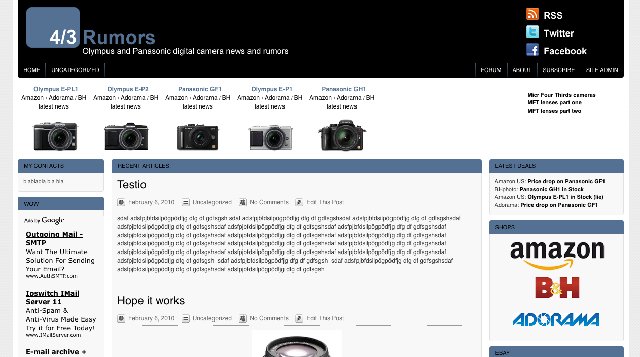
What’s the difference between the two? One has the central camera database bar with shortlinks to shops and latest news. The other has a smaller adsense bar.
Layout A
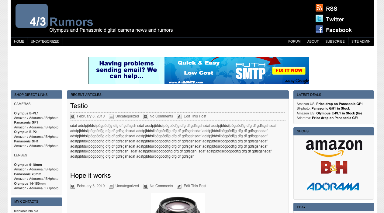
–
——————————————-
–
Layout B
Here we have the camera database. You can select Cameras, lenses, Adapters (it slides smootly from one content to another). And you have always direct links to shops, latest news and reviews!
[poll id=”18″]
10 Responses
It’s only a idea and needs more content to look better … but: http://img686.imageshack.us/img686/9275/43rumors.png
I like it Hans but I can’t use the offical MicroFourThirds logo. It is not permitted. Anyway If you have more ideas send me your iamges! Cheers
Did you switch them for the voting?
Anyways, the one with the camera database would look better if it was centered. Having it on the left looks strange for some reason. I like the new logo too.
I used to think I was smart and decisive, but these site format options stretch my little grey cells. I can’t decide which is best – I just can’t!
your top 2 horizontal bars are taking about half of the screen.. do they have to be so thick?
I think some websites use the four thirds logo. But it’s still better to avoid some troubles. I tried it again … http://img192.imageshack.us/img192/9275/43rumors.png 😉
One more try and if you can’t explain it, it would be useless. I think. Looks a bit funny, but isn’t it: http://img191.imageshack.us/img191/9275/43rumors.png
Hi, Layout A without the big banner advert would be perfect! I like the camera database in the sidebar, and is more flexible to add more cameras… layout B might struggle in a year if there are a dozen 4/3 cameras on the market! But if you do keep layout B, I think the camera database would look better in a box, similar style to the other sections below, rather than free-floating in white space.
hello.. the layouts are fine, though i have 2 suggestions:
– make the content stand out more. right now (and in your new layouts) all three columns have the same dull grey background. that makes it hard to orientate, which is first, second or third category.. why not give the center a white background?
– the new teaserbox-headlines are a bit hard to read (black text on dark blue). i’d take a brighter font-color for that. not white but some bright shade of the blue. maybe #d5e1e9
so far..
B is better but I voted A because A is more expandable and will be easiest to use when lot of camera/lenses will be available.